
AK Interactive Quick Gen Paints Review — Effortless

“Contrast” style paints, since their first appearance when Games Workshop debuted in 2019 are still a point of contention and conversation in the gaming and hobby community. Is “Slapchop” a viable method of painting? What about NewChop, or Slapchop 2.0, or whatever next thing a hobby influencer creates? Does the use of contrast style paints limit a painter from learning more? Is drybrushing or stippling better?
And not to mention the amount of product out there. GW, Army Painter, Green Stuff World, Vallejo, Scale75 all have rich lines of contrast style paints with various, confusing names. Speedpaint, Contrast, Dipping Inks, Xpress Colors, Instant Color…and now, we have another one. AK Quick Gen.
Do we need another line of paints? Another brand entering this already full market? After spending a few weeks with the AK Quick Gen line, my answer is yes, because there is no such thing as a perfect paint line, and these paints do some things great, and some things not so great. Let’s dive in.
Firstly, if you’re new to Contrast paints, here’s a quick info dump for ya:
– When used over a white primer or even a zenithal highlighted primer (this is when you prime a model from black to white, typically with white aimed at an angle to establish lighting or a hero moment), a contrast paint should flow evenly across the textures of a model, ideally settling in recesses, and with one coat. The goal of this is to save time on painting, so you can get to playing!
Great, now that you know some minimal knowledge of Contrast paints, you can safely venture further into this article.
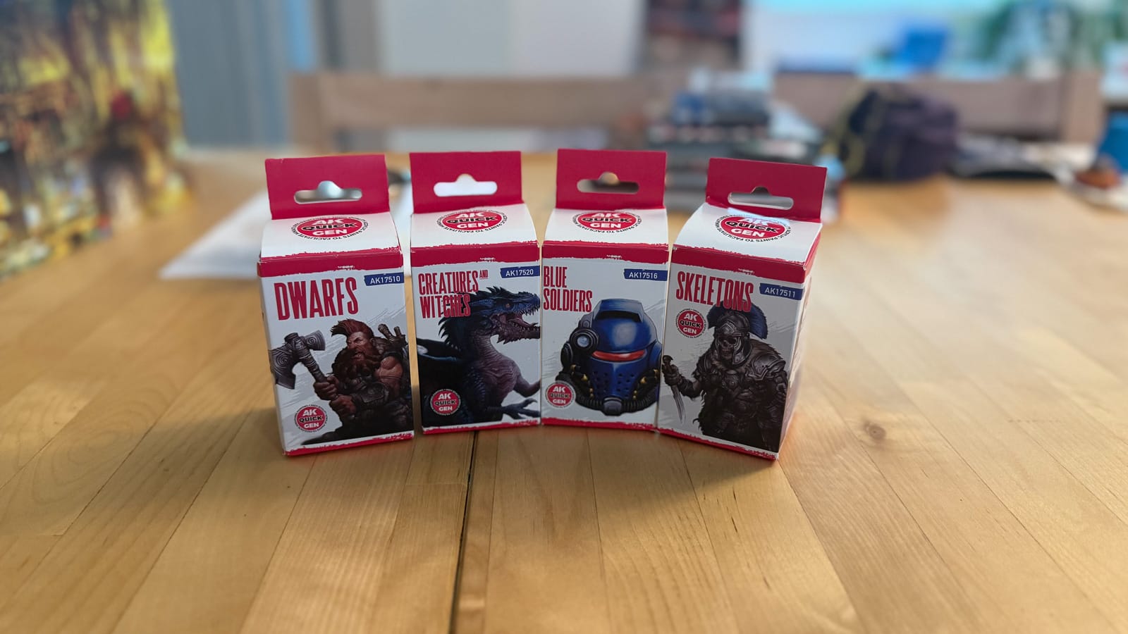
AK Interactive sent me 4 of their Quick Gen boxed lines, which are assembled according to the model that is on the package. As you can see, there’s a box for Skeletons (containing browns and a white), Blue Soldiers/Clearly SPACE MARINES (containing mostly blue, red and a metallic gold), Dwarfs (skintone and shadows), and the aptly named Creatures & Witches (magenta, blue, brown). One note about these choices is that 2 of the paints are doubled in these sets, so unless you want an additional White Shadow or Turquoise Blue, you might be better off buying a larger set or individual bottles on their own. I’ve also typically never had a good time with “themed” sets, as I tend to use a variety of colors in my paintings vs. what a company tells me what a leather or a skin tone is.
In the full range, you’ll find 80 colors, which go from 64 generic colors, 6 metallics, 9 military, and a medium. In my testing, I was given 16 paints, and 2 of them were doubles, so really, I had to play with 14, which limits what I can do, but I was pleasantly surprised.
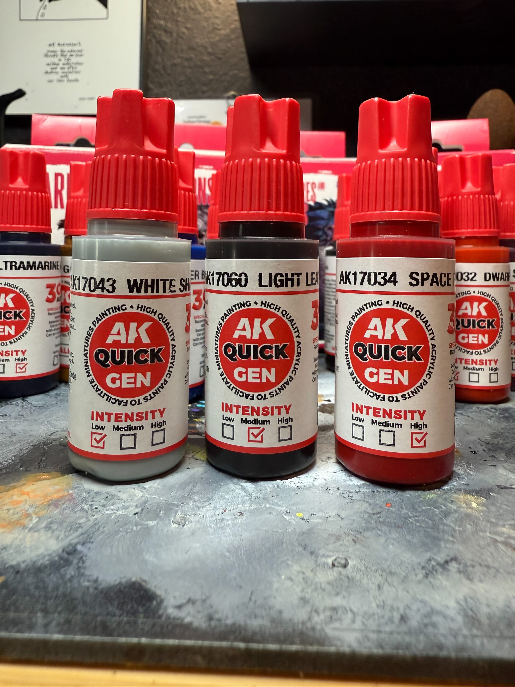
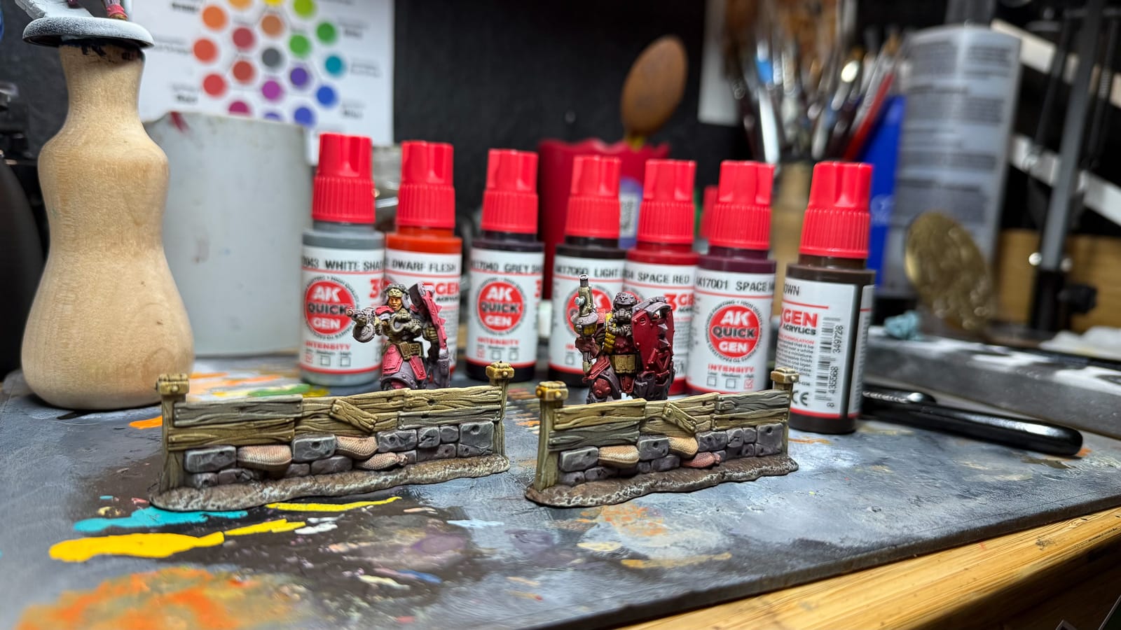
Packaging is solid. As expected with AK Interactive, these are high end paints in bottles that don’t seem to clog, and all are 18ml, similar to the rest of their line. Taking a note from Army Painter, AK is now including more valuable information on their bottles, this being an “intensity range” which lets you know how pigmented the particular paint is. This is extremely valuable and I hope other companies steal the concept, because one complaint I have with Contrast paints is that until you put paint on a surface, you’re taking a guess at how it’ll dry…and with the goal being “one coat” of paint, it’s important. Bravo on that design choice.
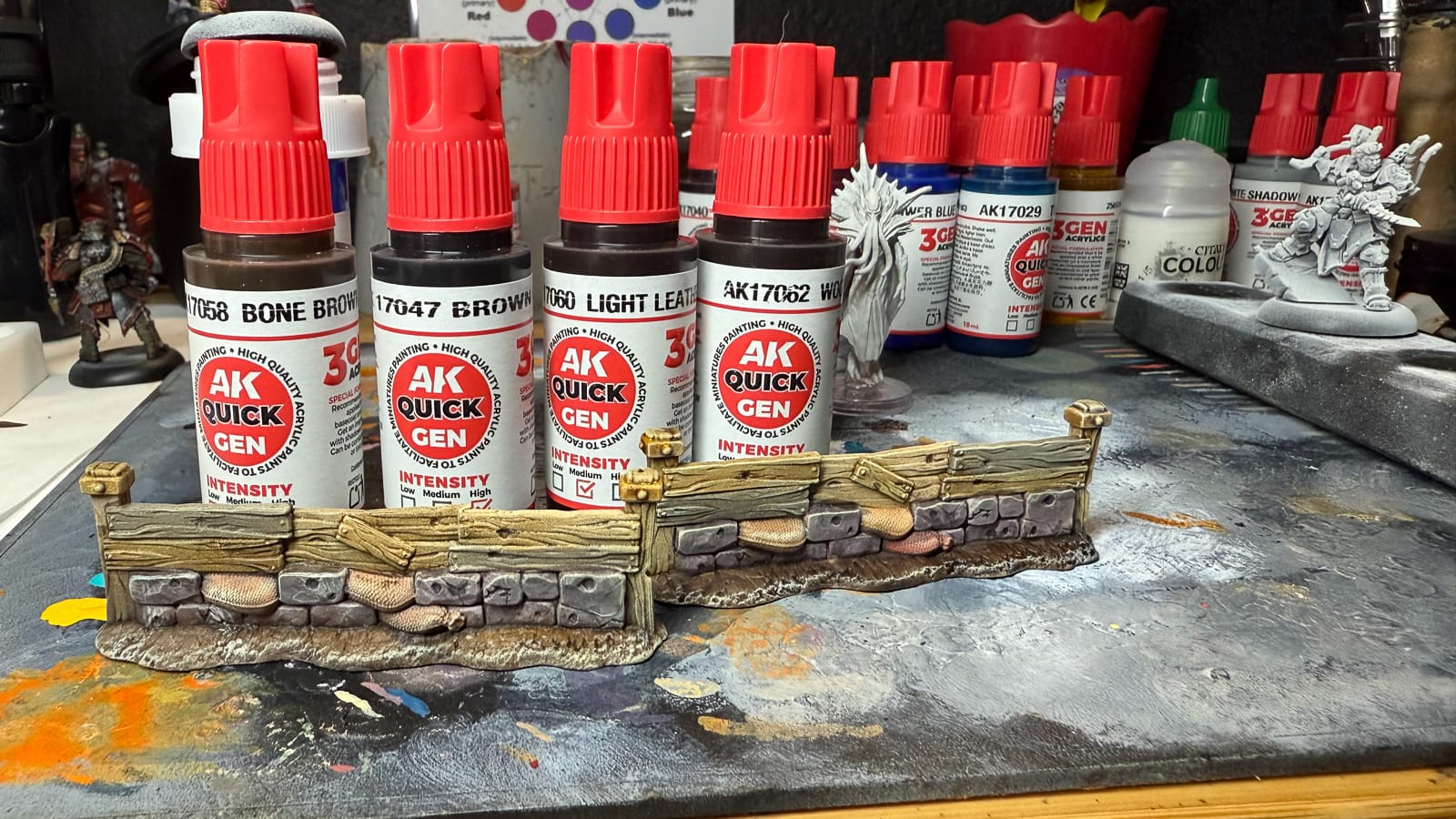
For my first test, I took some scatter terrain from Warmachine that I’ve been sitting on for a minute. I figured if I can’t get these done in the span of an hour, what am I even doing in this hobby? I chose a selection of browns including Wood, Bone Brown, and Light Leather, along with the strangely named “Gray Shadow”, and the only metallic I was provided, Gold.My first take with these paints is that they fulfill the promise. All of the wood you see in the photos was done with one pass, and blended perfectly. Wet blending with these paints is generally a risk due to the pigmentation of the paint but because of the labeling, I was able to guess at what the final result would be, and I was thrilled. The woods blended together and left a pleasing matte finish.
These paints are perfect for producing quick terrain scatter or larger pieces.
The gray shadow comes out with a hint of magenta, which I can see being useful for a dark dungeon, but not what I was originally expecting. Tale of Painters has an amazing chart you can reference if you really want to see what I mean. The gold was very surprising. Similar to Army Painter’s Speedpaint Metallics, the gold was plentiful and flowed extremely well. I really want to try the darker metals to see how they work.
Next, I moved into some models. I chose three, two of them being Warmachine models with plenty of crevices, along with some flat areas, and then a Wizkids model that was pre-primed. With these models, I learned some things I’ll share with you:
- Choice of primer matters
- Different areas of the model will react differently to paint
- Coats of paint matter greatly
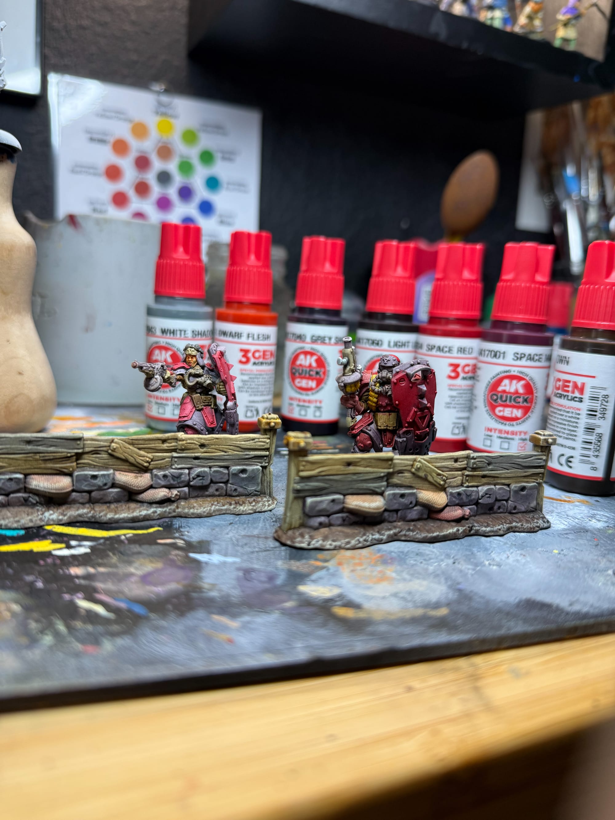
As you can see, primer matters. Our Mind Flayer is chunky, and the Khador Korps are matte and looking sharp, even with a few coats.
The Wizkids model is pre-primed, and if you’ve taken a deep look at those models, it tends to be somewhat glossy/satin, chunky at times. For my other models I used White Scar, which is a primer from GW that tends to put a slight matte texture on the piece.
Because of the sculpt and the primer, the way how paint reacts is important. The Wizkids model has wide areas without very well defined texture, and as a result, the paint just kind of sits on top of the texture, settling wherever it wants. This results in areas where paint pools, such as the dark areas on the cloak, unevenness in the headpiece, and areas where paint didn’t adhere very well on the head. The Warmachine models on the other hand are sculpted in a way that really helps the painter. Paint doesn’t pool in odd places, it flows across the model and fills in the gaps. You can notice this in the red and gray shadow armor bits, and the paint spread evenly on the bandolier and gun for the gold metallic.
I really want to lean into the labeling to help explain why these models look great, and for you to connect both the labeling and the previously mentioned quality of primer/model:
This labeling system really helps you decide which paints to use and how much to use.
Low intensity is comparable to a wash. Lots of transparency, and you may have to do multiple passes.
Medium intensity paints feel balanced. The darker browns all behaved like one of my favorite contrast paints, Snakebite Leather. If you had an “expectation” of contrast paints, this is it.
High intensity paints are incredibly dark, and I exercise caution with these. The blues will take over the party! These behave most like inks, but are receptive to thinning (I have a bottle of GW’s contrast medium, and it worked perfectly).
Back to the models, I was decently surprised with how the paint settled on the flat areas. Shields, armor panels all came out really well. The reds needed 2-3 coats, the gray shadow needed 2, and the browns would have been fine with 1, but I went for 2 on leather items (bags, shoes, inner outfit). And while our Mind Flayer is looking heavily saturated, some basic layering would help, but in the future, I will be more selective with my paint technique.
The end result is some models with some additional work, would be perfect for the tabletop. On the terrain, all I did to finish up was a dry brush of Ice Yellow and some pigments, and my scatter is ready for play!
On the negative side, there are some minor ones, but nothing that would stop me from buying these paints. As previously mentioned, I think these “themed” packs don’t give you enough diversity. “Skeletons” are 3 brown colors and a white. I think a themed pack should demonstrate balance across its paints, giving the painter a sample of what a line has to offer. The other issue, I had to verify with a few other painters…but there is an aroma. Once you let these paints sit in your wet palette either overnight or a few nights as I did, the remaining paint develops a smell reminiscent of old dairy. I’m actually going to reach out to AK Interactive about this and ask, because it’s truly weird. But it doesn’t affect the performance, so I won’t let that affect my score.
Finally, let’s talk value. These paints are affordable! After conversion from euro to dollar, these paints are roughly $3.46, which puts them at a price advantage against GW and Army Painter. And in a world where there’s plenty of competition, saving a few dollars to put together the paint scheme you need is pretty important.
Review Guidelines
85
AK Interactive Quick Gen Paints
Great
AK Interactive Quick Gen paints are a fantastic contrast paint, but I recommend purchasing singles, unless you can drop money on the entire range.
Pros
- Fantastic flow and “contrast” properties
- Intensity system is a perfect addition
- Easy to use
Cons
- Limited by the themed packages
- An unusual smell if the paint is left out
This review is based on a retail copy provided by the publisher.
Share this article
Affiliate Links


 Review — High-spec hardware, mid-range mobility")